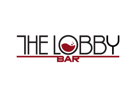
The Lobby Bar was a new upscale bar/lounge opening in Oklahoma City. The client was remodeling both the interior and exterior of a popular old theator located near downtown. The structure is classic Art Deco and was being reworked to showcase that same design style.
The first design I created was rejected by the client, so I was forced to regroup and take another stab at it. To see the first design I created click on the above image. I will explain that design further down.
The client wasn't happy with my first design and requested some kind of graphic be introduced into the identity. I disagreed with the new direction but had to make it work so I simply reworked my design to fulfull the clients wishes.
I didn't want to focus on standard bar imagery so I decided to focus on a glass of wine since this was an upscale lounge. I didn't want to change the typeface so I had to perform some mild surgery to make the O directly in the middle of the logo. The client specifically asked that bar be placed under the main text, so I simply integrated it into a baseline to give the mark some visual stability as well as put emphasis on The Lobby.
The first logo created for this client was a better fit. The project started with numerous limitations. First, the architect was strongly against hiring a designer to create the logo because he simply wanted to set The Lobby Bar in a standard unaltered Art Deco Typeface. Because of this, the architect only provided enough room on the marque for the vertical space of the bar name. That resulted in a huge limitation on what I could provide because I was not able to illustrate anything significant above or below the typeface.
I presented a logo that focused on a custom Art Deco typeface which would visually integrate into the surrounding architecture. The vertical line splitting the logo would continue until it collided with the neighboring walls. The inspiration for the vertical line came from the architecture. The building has numerous horizontal decorative lines and the proposed logo would have blended and integrated seamlessly into the design of the structure. The horizontal line dividing the O replicates the same treatment as the O used on the exsisting theater sign. This helped pull the two entities together into one singular visual package.

- //CONTACT
- email@matthewmckim.com
- Web Form
- 918.606.3367
- follow me on Twitter
- © All this stuff is mine
