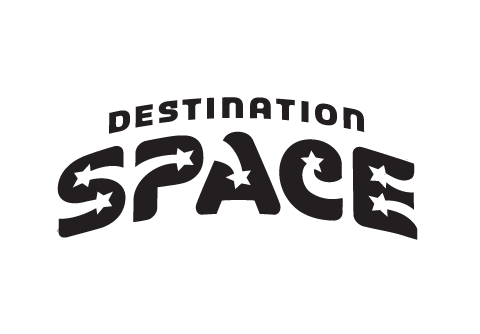
Science Museum Oklahoma was creating a new space exhibit and, among other things, needed a logo. The exhibit was about various aspects of space exploration and contained five rooms dedicated to different areas of space study. The target market is geared towards children and early teens, but will obviously be attended by family and older viewers interested in general space knowledge.
The solution is an identity that is composed of a custom type treatment on a curved baseline. DESTINATION is played down while SPACE is large and visually the dominant focal point. Space is big, and this logo communicates that specific observation. The curved baseline represents the curvature of the earth and/or other spacial bodies and the stars represent, well, stars.

- //CONTACT
- email@matthewmckim.com
- Web Form
- 918.606.3367
- follow me on Twitter
- © All this stuff is mine
