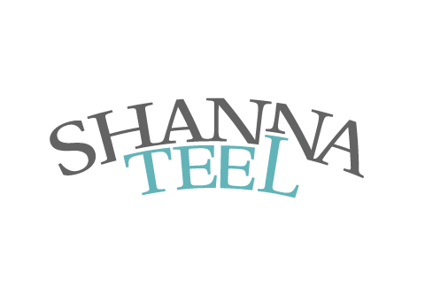
Shanna Teel is a motivational speaker. She required a branding solution that was appropriate to her main target demographic which is large corporate businesses.
The solution focuses on a rising letter L. This symbolizes growth, help, and strength. The L also symbolizes an upward moving graph showing increased productivity, an increase in self-worth, and an upward growth in sales.
The L pushes against the N representing the idea of pushing thru personal obstacles or overcoming tough challenges. A motivational speaker must inspire people to make changes in their lives by pushing thru various adversities.
The entire mark is on a curved baseline to add a fun presentation representative of Mrs. Teels speaking style. This curve also subtly suggests a sunrise, a new day, or a new way of thinking.
Her last name rises and pushes up the bottom of her first name. This visual merging of both names represents ideas of coming together, working together, being close, embracing, and sharing.
To play off her last name, the color scheme is a teal paired with a soft gray. This allows the final logo to have both a corporate color pallet combined with a subtle feminine appearance.
The typeface is a beautiful serif which communicates professionalism and fits in nicely with her target market. Her last name has been shortened vertically to allow Shanna to be the dominant visual. This creates a more personal logo; Puting focus on her first name creates a more friendly/personal identity.

- //CONTACT
- email@matthewmckim.com
- Web Form
- 918.606.3367
- follow me on Twitter
- © All this stuff is mine
