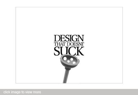
When the time came for my senior design show in college, I was honored with the task of designing all the materials for the event. I had to come up with a theme as well as all the visual materials such as mailers, posters, and name tags.
I decided to use the theme Design That Doesn't Suck. This seemed appropriate due to falling attendance from professionals in the community. It was believed that the decline in attendace was due to the fall in quality of the show in recent years. I wanted to directly combat this idea head on; This show was going to be great!
With the help of one of my professors we took photos of items that were designed to suck, but had been altered in a way that made sucking nearly impossible. This simple concept visually communicated our message in a humorous manner.
These particular mailers were printed in one color to save on printing costs. The idea was to send out three mailers to each individual a few days apart, which meant printing three times as many. Luckily, a local printer donated the majority of the printing to the school. By sending each person three cards we were able to build up excitement for the event.
The backs of the cards continue the "Doesn't Suck" theme by incorporating the concept into a time, a map, and a date.
- //CONTACT
- email@matthewmckim.com
- Web Form
- 918.606.3367
- follow me on Twitter
- © All this stuff is mine