This is a client that created a simple childrens chew toy. The idea came to her when she noticed her child chewing on the straps of his child seat. This caused some problems because the straps are not removable and cleaning them was a hassle. In an attempt to fix the problem she simply added a removable strap to the seat, to which her child began chewing on that particular strap instead. The strap was easily removable and allowed her to simply toss it in the washing machine.
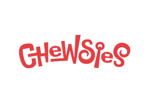
The product is merely a lockable ring with a strand of material attached. To brand this toy I decided to create a custom typographic treatment for the name. The final result is a fun solution with subtle hints as to the products purpose.
The C is chewing on the neighboring H which directly communicates the purpose of the product. The I is rendered to visually resemble the product. Red is used because of its association with hunger as well as love, energy and desire.

- //CONTACT
- email@matthewmckim.com
- Web Form
- 918.606.3367
- follow me on Twitter
- © All this stuff is mine
